

STORY
The Marching Penguin team was in search of a solution to common difficulties in their production workflow. After conducting user research and marketplace analysis, work began on designing an MVP of myproducer.io.
MP is a platform for producers to keep track of their available crew members and schedule productions with ease and communicate with their teams.
OVERVIEW
My Role: UX/UI Lead
Tools: Sketch App, InVision, Google Hangout, Keynote
Ideation
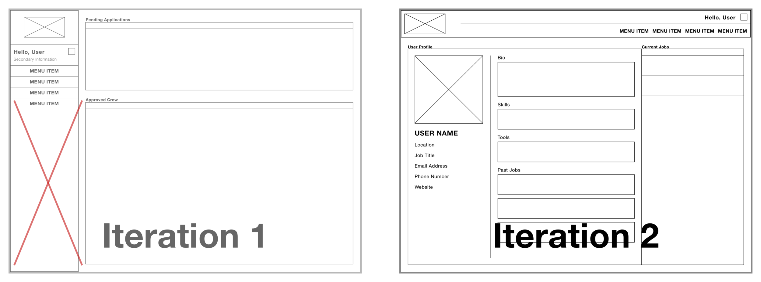
When sketching and wireframing options for the basic structure of the site, I began with a static left side global navigation. This would have allowed for the right side to expand as far as it needed. Two things... there were not going to be that many navigation options so we would be left with a ton of dead space at the bottom AND considering our users would be using laptops an iPads on the go, I wanted to be sure we could maximize our use of available screen space.
REGISTRATION WIREFLOW

Display and style
Talking with producers about their work and the structure of their day, it was evident that they would usually find themselves on location while doing their production planning. This usually meant that they would be in the back of a dark sound stage while shooting was happening. Keeping these environmental factors in mind, I went with a darker color palette so not to strain their eyes and also not to have a bright glowing screen on set.

