
OVERVIEW
Role: Project Manager, Information Architect, Mobile UI Designer and Prototyper
Team: Dan Richardson, Jackie Lee and Chris Jeong
Tools: OmniGraffle, Atomic.io, Apptourage, Adobe Photoshop, Sketch, POP app, Trello and Slack
STORY
In the modern world there are many ways to track your health, sort through your prescriptions, call for help and manage your doctor appointments. The problem is that there are many separate ways to do all of these tasks.
With Nurse, our team attempted to create one single hub for all of the different aspects involved with monitoring your own health. Along the way we tried to deal with concerns about privacy and accessibility and make it customizable to best fit the needs of all users.
RESEARCH
For us to be able to manage all of the information and possibilities related to this project, it was important for our team to split off with specific areas of focus and then come together with our findings. This is an approach that we incorporated though many steps of this process. Our areas of focus were:
- Similar Health Tracking / Medical Record Apps
- Marketplace Frustrations and Opportunities
- Hardware & Technology Limitations

OUR USERS
Our team surveyed people of all different ages, genders and medical backgrounds. In addition to questions about medical histories and health record tracking, we wanted to know about the users relationships to their digital devices.

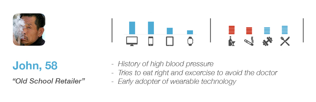
We were able to refine our scope based around the profiles of 3 key users to come out of our survey and interview phase. John, an older male with a history of high blood pressure and a shockingly high wearable usage rate, allowed us to focus on building out a medical emergency alert system.
PAIN POINTS OF CURRENT ELECTRONIC HEALTH RECORD PROGRAMS:
- Poor product configurability
- Privacy concerns
- Lack of interoperability
- High cost
INFORMATION ARCHITECTURE
During our user research we were able to identify key features that our users would like to have available to them.
As a follow up to our interviews, we had multiple users partake in card-sorting exercises to better understand how they would expect to see all of these features arranged.

DESIGN STUDIO

Once we had determined our users and pin pointed what was important to them, we attempted to visualize the arrangement. Similarly to our research period, all members of the team went off separately and came together to share their findings. Once we were in the thick of the design studio, we came across the concept of widgets which we thought might address the user concern of their health records not being customizable.
The widgets also provided a potential for expansion and business development that we had not originally taken in to consideration. With the ability to add, remove and re-order specialized pods of information, we've opened the door for future in-app purchases and development relationships with outside companies.
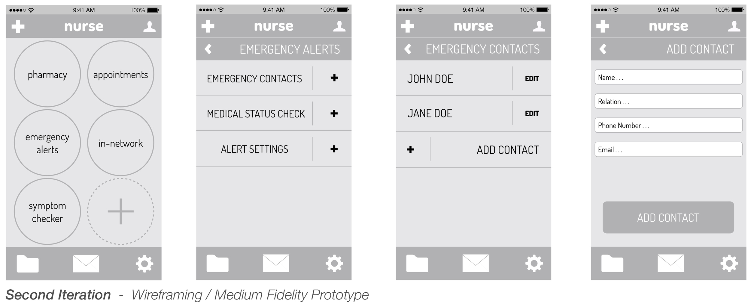
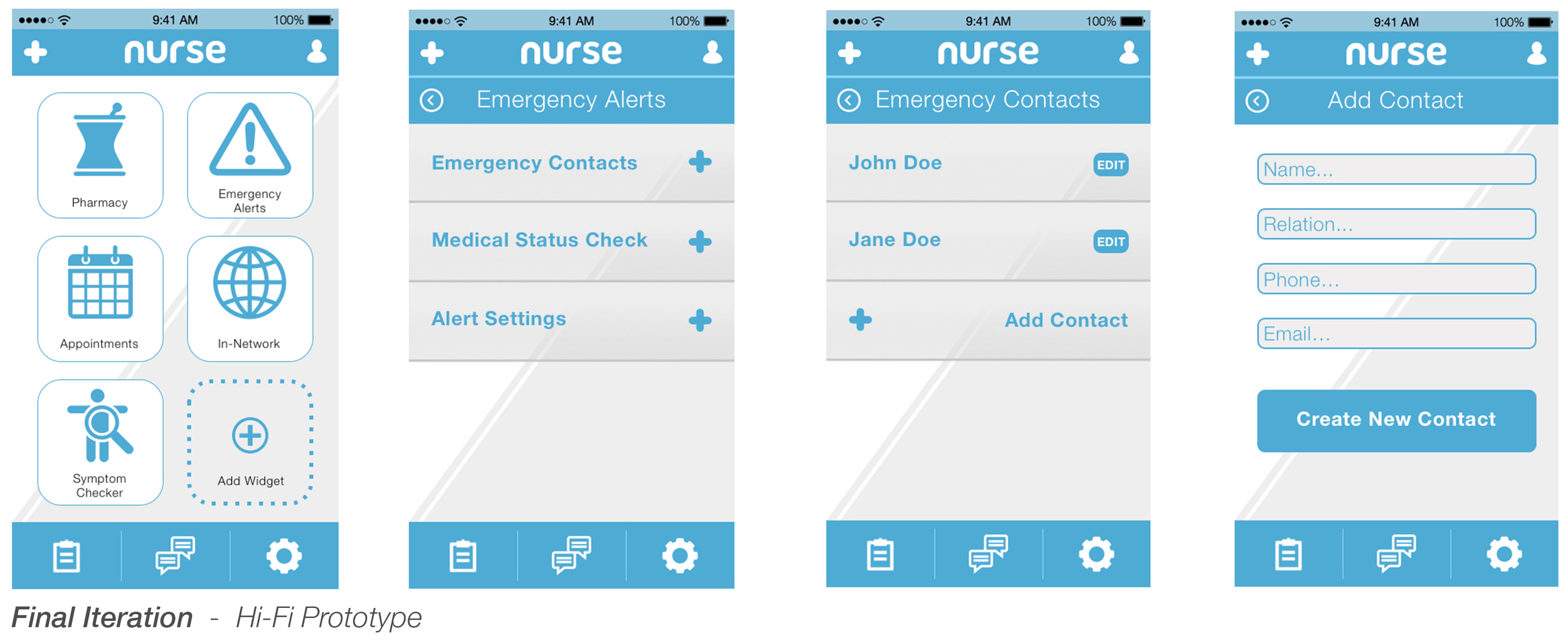
MOBILE DESIGN ITERATIONS
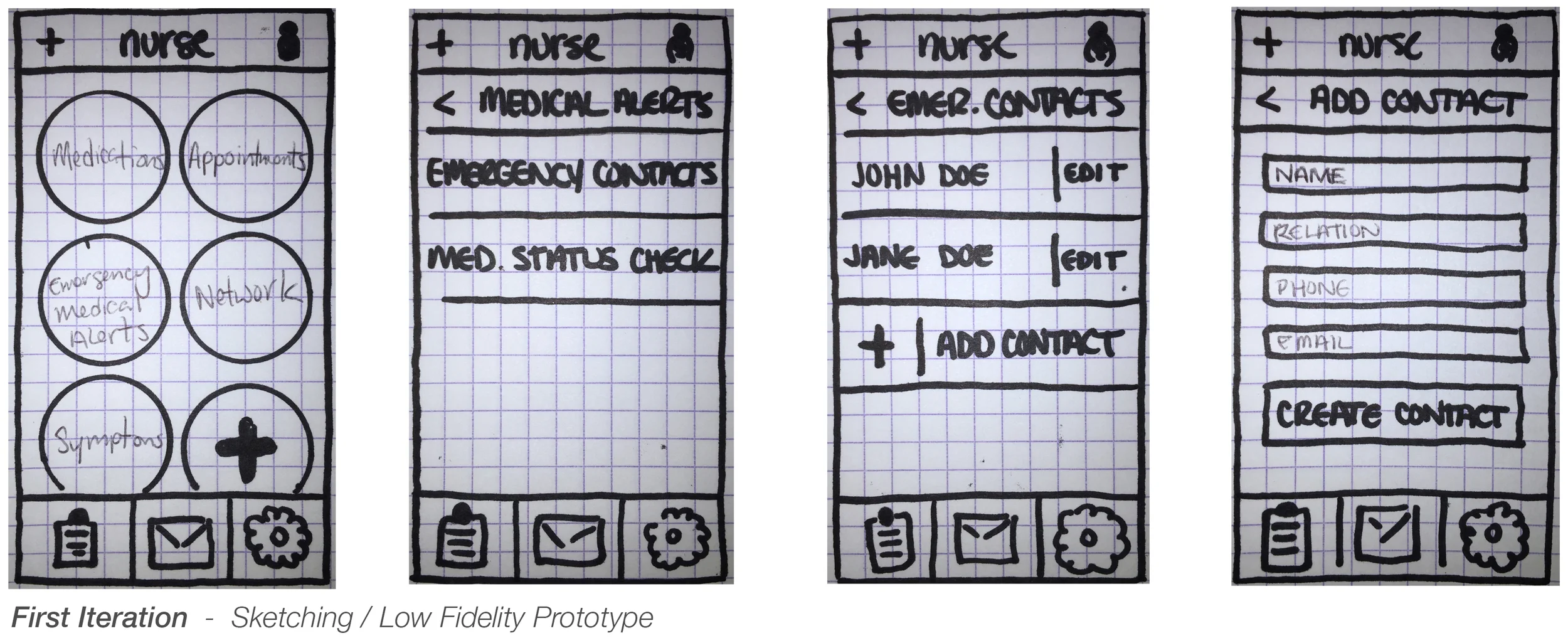
First Iteration - The first iteration was the culmination of our team coming together in the design studio phase. We tested users by asking the users to add an emergency contact to their list. The results were that users went everywhere but where we wanted them to go. At the conclusion of the test, we determined that the widget language was to blame.
Second Iteration - With the second iteration we adjusted the language and built the connection that was most intuitive to users in the first round. The biggest concern from this round of testing was surrounding the 'Add Widget' button.
Final Iteration - While taking the mock-up high fidelity we tried to iron out all points of confusion that came up due to the lower fidelity of previous versions. We added language to the 'Add Widget' button as well as developing a short onboarding flow for first time users.
EMERGENCY ALERT SYSTEM
The main flow that we focused on for the sake of product development and presentation was the scenario that our user John Doe was creating a list of Emergency Contacts and then some time later, needing to contact them during an actual emergency.

Mobile App Flow
Our users are able to access their list of emergency contacts from multiple points on the home screen. There is a link in their profile settings, a link in the drop down menu but most prominently featured in one of their selected widgets.

Apple Watch Flow
Once an emergency has been detected through a drastic change in heart rate combined with any accelerometer information, a interactive flow is initiated.
- In the event of the user being unresponsive, Nurse will automatically send a message to the designated emergency contacts after a time.
- If the user is responsive but needs help, they can expedite the process of reaching out to their designated contact and can additionally call 911 if need be.
- If the emergency alert is a false alarm, the user is allowed the opportunity to cancel it out and tell the system that they are okay.
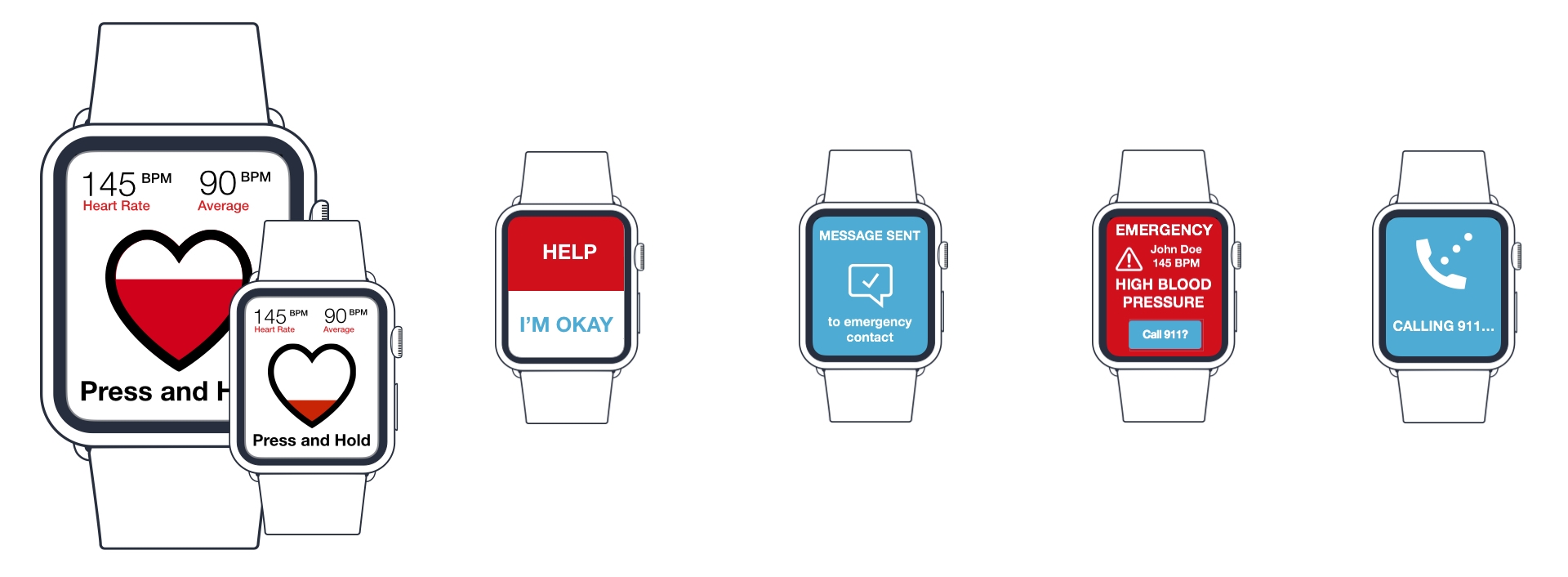
Accessibility In The Face Of An Emergency
The Apple Watch Emergency Alert system was created to take several accessibility factors in to consideration. When the alert is initiated, the Apple Watch delivers haptic feedback and emits a sound of increasing volume as the heart (a visual representation of a timer) drains.
We had initially gone with the traditional color scheme of red and green to signify 'Help', 'I'm Okay' as well as normal phone functionality. However, while trying to make this portion of the process as error free as possible, we discovered that 4.5% of the world population is affected by color blindness and that issues with red and green were the most common.
Our most important development in regards to eliminating errors was to establish the proper gesture needed to initiate the flow. After observing the way that bodies moved during heart attacks we settled on 'Force Touch' as a way of conveying true intention in the event that the user is actually okay.
Emergency Alert Screens
When contact has been requested, Nurse will take on different forms across multiple devices. On the phone of the contact, they will receive a series of texts detailing the situation.
On the watch and phone of the user are screens showcasing information related to the emergency so that if they are found unresponsive by a good samaritan, that person is informed as much as possible.
Privacy was a huge concern with our users and we have taken this in to account at this stage as well. Unlike other apps, this detailed information is only made available after an actual emergency has been detected.
