
STORY
Quantum Reference is a search engine for students and professors that extracts sentences, equations, figures, images and more from a personal database of their own documents and files.
PROBLEMS
- How do you effectively display search results made up of paragraphs, equations, tables and figures from 20 different documents in a library of hundreds?
- How do you visualize a network of related documents to show a user where they can find supporting information to help them understand a complex concept?
- How do you streamline the upload and tagging process so that users are able to utilize the full extent of their library with as little work as possible?
OVERVIEW
This project began as a 3 week project with a small design team but after the initial duration I continued to work with the Quantum Reference team to further develop and test functionality.
Initial Project Details -
Team: Myself, Kevin Merkel and Sage Molotov
My Role: UX Designer, Project Manager, Information Architect and Client Lead
Tools: Microsoft Excel, Whiteboard, Pen & Paper, Sketch App, Keynote, Trello, Slack and UserTesting.com
Continued Project Details -
My Role: UX / UI Design Lead
Tools: Sketch App, InVision, Trello, Slack, Apptourage
PROJECT PLANNING
Detailed project planning was required in order to ensure that we as a group were maximizing not only our time but also our potential.
With heavy research and problem solving being the early focus, we needed to be sure that this phase did not extend too far across our timeline. The full project plan above gave us target dates for completing individual tasks while first stipulating when each task could begin, so that we didn't get too far ahead of ourselves.
The 'RACI' Chart to the right informed all team members of their responsibilities as well as illustrated the big picture of how and when the team needed to work together.
USER RESEARCH
Our client had performed many interviews with potential users prior to us joining the party and the results were that users were actually quite happy with the system of file organization that they had created for themselves but only because they hadn't found a better option.
We created surveys to help us better understand the behaviors and motivations of our users, we wanted to know their true pains and needs. We focused on Jason Flemming, our Teaching Assistant (TA) personal because he was the middle ground between the students and the professors.
Users just wanted to access the information they were looking for as accurately and quickly as possible. With Quantum Reference we were going to give them that ability but in a way that they had not seen before. It was on us as a UX design team to make this product as familiar as possible to be as successful as possible.

MARKETPLACE ANALYSIS
We performed a detailed analysis of other top personal educational resources in the marketplace to determine where our true opportunities for success were with this product.
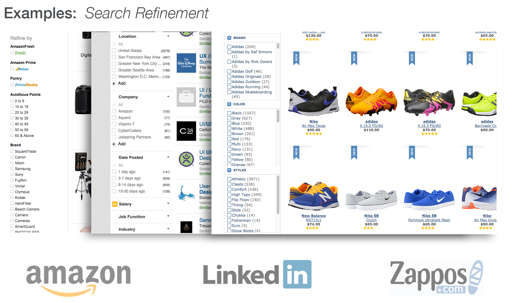
Given the specific problems we were trying to solve, we also looked to websites like Wikipedia and features like Amazon Xray to help us understand how to best structure a web of information.

THE DESIGN PROCESS
We looked all across the internet for best practices in the area of visualizing a web of information. We realized that e-commerce websites dealt with these issues very successfully and in ways that would be very familiar to our users.


We took those best practices in to consideration as we tried to create a solution that we though would work best for this product.
Moving from the whiteboard to paper, we went with a design that featured tiles as our method for returning search results. Similar to product windows on a webstore but also calling back to a tactile example of a research tool mentioned in our user interviews, index cards.
This option allowed us to showcase all different types of media in the results while also keeping them in a unified format. Further down the line, this design also leant itself to very interesting interaction design.

TESTING
Takeaways:
- Our upload process was created to be as minimal as possible, but users felt like they were flying blind at times. We need to keep them better informed going forward.
- There were several instances of user confusion coming from misleading color selections in the UI.
- Several users said that they wished that they had a tool like this now while they were in school because they could already see the benefits.
