
OVERVIEW
Role: Lead UX/UI, Information Architect, Storyteller
Tools: Pen and Paper, Keynote, Adobe Photoshop and OmniGraffle
Deliverables: User research, Sketches, Site Map, IA, Hand drawn wireframes and Prototype
PROBLEM
The Maintain Skate Shop site is disjointed and their web store is sparsely populated. This disorganization is keeping people from shopping and interacting with the brand.
SOLUTION
To design an intuitive experience for both the business and customers utilizing a "mobile first" approach.
THE BUSINESS
Business Pain Points:
- There is no time to run both the store and the web store.
- Price matching the "big guys" just isn't financially possible.
- The website is to the best of the owners abilities.
Business Goals:
- Tell the Maintain story.
- To increase web sales without drastically increasing front end work.
- Site needs to be easy to... maintain.
THE USERS

User research for this project was performed through a combination in-person interviews and surveys. Talking with Alex, the shop owner, helped illuminate customer demographics that were later confirmed and clarified during the survey period.

RESEARCH
User Survey
After surveying users it became apparent that customers were much more likely to purchase apparel online over decks and hardware.
This revelation was both instrumental for the Information Architecture, but also for focusing the business model.


Comparative & Competitive Analysis
Comparing Maintain to the competition allowed us to determine what makes the shop unique.
- Local
- Exclusive
- Culture

INFORMATION ARCHITECTURE
Inviting users to participate in card sorting exercises allowed me to discover what order of features and information would make the most sense to real site visitors. Staying with the 'mobile first' approach, I wanted to keep the global navigation as small as possible while keeping the number of clicks to a minimum.

SKETCHING
With the site navigation sorted and general structure mapped out I was able to begin sketching the mobile UI. The goal was to establish a modular template style design that would easily adjust to different screen sizes and maintain visual continuity. Starting on a small mobile screen helped to eliminate unneeded frills and keep the clean appearance that Maintain's customers expect.
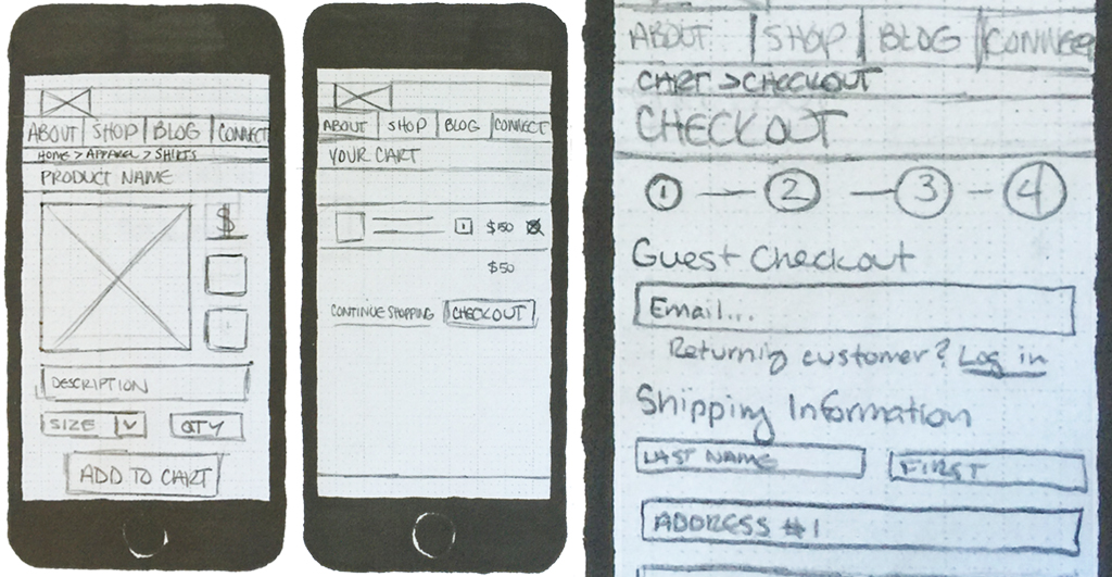
Various screens to show sketching detail.
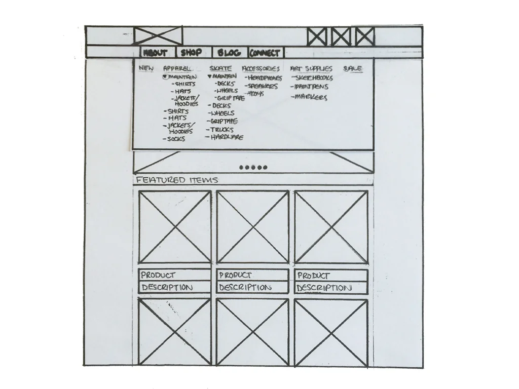
WIREFRAMES
After sketching out all of the unique screens for mobile, I expanded the features and functions to occupy the canvas of a full computer screen. Drawing out the desktop with more clarity allowed me to build a paper prototype and begin my user testing and iterations.


HI-FI MOCKUP
After user testing the paper prototype and taking all feedback in to consideration I was able to begin designing a hi-fi mock up. This iteration includes changes to the size and placement of page elements as well as increased communication during the check out process.


